29 May 2016

Palluran paluu


(FI) Ihania jättilaukan kukkia oli jälleen saapunut lähikukkakauppaan ja ostin yhden violetin pallon sohvapöydälle. Istutin viime syksynä jättilaukan sipuleita omallekin pihalle, mutta pettymyksekseni vain kolme niistä kukkii. Ryhmä on sen verran harva, etten raaski leikata sieltä yhtäkään kukkaa maljakkoon. Täytyy varmaan syksyllä istuttaa vielä jokunen sipuli lisää, jos vain löydän niitä jostakin. Nämä sipulit toimme viime kesän Amsterdamin reissulta. Mukavaa sunnuntai-iltapäivää ja -iltaa!

(IT) I bellissimi fiori di aglio gigante sono di nuovo arrivati dal fioraio e ho preso una pallina viola per il tavolino in soggiorno. Ho piantato bulbi di Allium anche nel nostro giardino lo scorso autunno ma per la mia delusione solo tre fioriscono ora e siccome sono già pochi non li voglio tagliare. In autunno potrei piantare qualche bulbo in più se solo li trovo da qualche parte. Questi qui li avevo portati dall'Amsterdam. Buona serata di domenica!

(EN) The florist had some beautiful Allium giganteum flowers again so I bought one purple ball for the coffee table. Last autumn I planted some bulbs also in our garden but to my disappointment only three of them are flowering so I don't want to cut any of them. Maybe I'll plant some more bulbs this autumn if I can find them somewhere. These ones I bought from Amsterdam last summer. Have a lovely Sunday evening!


26 May 2016

Kuudes maalikerros toden sanoo (ehkä)


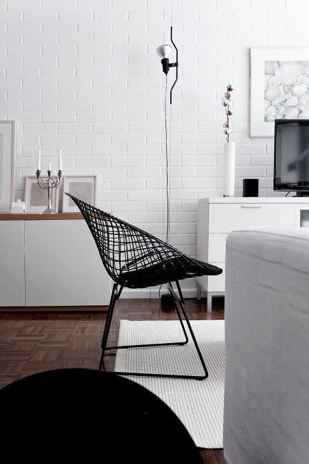
(FI) Joskus pienestä hommasta tulee yllättävän iso. Minulle niin kävi viimeksi tämän pikkupöydän kanssa. Ostin tammisen pöydän vanhantavaranliikkeestä viitosella ullakon kesähuonetta varten (siitä lisää myöhemmin), ja koska punertava petsipinta ei miellyttänyt itseäni eikä tyttäriä, ajattelin vetäistä pöytään nopeasti maalia pintaan. Oma valintani olisi ollut musta, mutta tyttäriä väri ei miellyttänyt, joten hioin pinnan huolella ja ryhdyin maalaaman valkoisella kalustemaalilla. Tuoreeltaan pinta näytti hyvältä, mutta kun menin hetken kuluttua katsomaan, valkoiseen pohjamaaliin oli tullut kellertävä sävy. Ajattelin, että ongelma hoituu kyllä, kun maalia tulee useampi kerros, mutta kolmannen kerroksen jälkeen tajusin, että petsi tulisi aina vain läpi. Niinpä vaihdoin sävytettyyn Annie Sloanin kalkkimaaliin. Maalasin pinnan sävyllä Paloma ja levitin kuivuneen maalin pinnalle kerroksen vahaa. Kaikki hyvin, paitsi että sävy taittoi ihan liikaa violettiin. Seuraavaksi kerros Paris Greytä ja jälleen vahaa. Tein vahausoperaation pöydällä, jolla tyttäret olivat juuri askarrelleet, ja lopuksi huomasin, että valmiissa pinnassa oli siellä täällä ihanasti kimalletta. Ei muuta kuin alustan huolellinen puhdistus, seuraava maalikerros pintaan ja lopuksi vielä pari kerrosta vahaa. Nyt pöytä on vihdoin valmis ja kannettu jo ullakolle, mutta... olen yhä sitä mieltä, että musta maali olisi sopinut siihen paljon paremmin kuin nykyinen väri, joka kyllä kuvassa näyttää paljon sinisemmältä kuin oikeasti on. Maalatako vielä kerros lisää vaiko ei, siinäpä pulma...

Koska tuunauspostauksia on ainakin minusta hauska lukea, tässä iloksenne muutama linkki ilmeisesti vähän suoraviivaisemmin sujuneisiin projekteihin: Oblik-blogin Jutta maalasi rohkeasti kalkkimaalilla maton. Lauran Sateenkaaria ja serpentiiniä -blogissa on uudistettu kalkkimaalilla pinnatuoleja ja vanha lääkekaappi. Sisustuskarusellin Pia on sutinut kalusteita mustiksi saunavahalla ja uudistanut tv-tason ja keittiötikkaat vanerilla. Jos olette itse tehneet kivoja tuunausprojekteja, kertokaa ihmeessä niistä kommenttilaatikossa!

(IT) A volte un lavoro piccolo diventa sorprendentemente grande. Di recente mi e successo quando mi sono messa a verniciare il tavolino nelle foto. Ho comprato il tavolino in rovere da un mercatino dell'usato per cinque euro per la stanza estiva che stiamo facendo nella soffitta (ve ne racconterò di più un'altra volta). Siccome il colore molto rosso non piaceva ne a me ne alle mie figlie ho pensato di darci una passata veloce di vernice. Io avrei scelto nero come colore ma le figlie non erano d'accordo quindi ho levigato bene la superficie e cominciato a verniciare con la vernice bianca. Dopo il primo strato il risultato sembrava buono ma quando sono tornata a vedere il colore era diventato un po' giallo. Ho capito che il colorante che avevano usato si scioglieva nella vernice. Ho pensato che basterebbe aggiungere un paio di strati ma no. Nulla da fare, il colore giallino tornava sempre. Allora ho cambiato per la vernice gessosa di Annie Sloan. Ho dato una passata della sfumatura Paloma e poi uno strato di cera. Non male ma il colore era veramente troppo viola. Dunque una passata di Paris Grey e poi ancora cera. Ho messo la cera sul tavolo dove le figlie avevano fatto dei lavoretti e alla fine mi sono accorta che un po' di glitter si era attaccato alla cera qua e là. Ho dovuto dare un'ulteriore passata di vernice e in fine un paio di strati di cera. Ora il tavolino è pronto e in soffitta ma... penso ancora che la vernice nera ci sarebbe stata meglio che il colore attuale che però non è così blu come sembra nella foto. Verniciare o non verniciare, questo è il dilemma...

Siccome a me piace molto leggere post col tema fai da te, eccovi alcuni link ai progetti che altre blogger hanno realizzato, evidentemente anche con più successo: Jutta dal blog Oblik ha decorato un tappeto con la vernice gessosa. Laura, la blogger dietro il blog Sateenkaaria ja serpentiiniä, ha rinnovato con la vernice gessosa alcune sedie e anche un vecchio armadietto per le medicinali. Pia ha dipinto nel suo blog Sisustuskaruselli mobili con cera nera per la sauna e rinnovato un carrello per televisore e uno sgabello utilizzando compensato di betulla. Mi farebbe molto piacere sentire anche dei vostri progetti nei commenti!

(EN) Sometimes a small project turns into a big one. This happend to me lately with the small table in the pictures. I bought the oak table in a second-hand shop for five euros for the summer room we're making in the attic (I'll tell you more about that project in another post) and since me and my girls didn't really like the red stain on the wood I thought I could just quickly paint it over. I would have chosen black paint but my daughters didn't like the idea so I sanded the surface well and started to paint with white paint. After I finished the first layer the result seemed quite good but when I returned to see the table I noticed that the paint had turned a bit yellow. Nothing a couple of more layers of paint wouldn't fix, I thought. After the third layer I realized that the stain would just continue to come into the surface so I changed to Annie Sloan Chalk Paint. A layer of Paloma and then a layer of wax. Not bad but the colour was really too purple. So another layer of paint, this time Paris Grey and then again some wax. I spread the wax on a table where my girls had been doing some crafts projects and at the end I noticed that there was some glitter in the wax surface. So I had to add one more layer of paint and at the end good two layers of wax. Not the table is ready and in the attic room but I still think that it would look better in black than in the current colour that isn't really as blue as it seems in the picture. To paint or not to paint, that is the question...

Since I really enjoy reading diy posts, here are some link to projects other bloggers have done that were evidently a bit more successful: Jutta from the blog Oblik decorated a rug with chalk paint. Laura has painted with chalk paint some chairs and an old medicine cabinet in her blog Sateenkaaria ja serpenttiniä. Pia, the blogger behind the blog Sisustuskaruselli has turned some pieces of furniture black with sauna wax and given a new life to an old tv trolley and a kitchen ladder using birch plywood.  If you have done some nice projects yourself, please leave a comment and tell me about them!


ennen / prima / before

23 May 2016

Maalitestailua


(FI) Meillä on parhaillaan meneillään monenlaista projektia sekä sisällä että ulkona, joten ei kannata ihmetellä, jollen ehdi blogia kovin usein päivittää. Vanhoihin kehyksiin teettämäni ruokasalin peili on vihdoin valmis ja noudettu, mutta ennen sen ripustamista haluan maalata taustalla olevan seinän jollain sävyllä, joka antaa tilaan vähän kontrastia ja syvyyttä. Olen tilannut jo viisi eri maalinäytettä ja ensimmäinen vihertävä sävy oli koko perheen mielestä ehdottomasti virhevalinta. Nyt kokeilussa on ollut kolme harmaan sävyä, joista yksi on selkeästi beigeen vivahtava eli greige, sekä yksi vielä vaaleampi sävy, joka karsiutui heti kättelyssä pois. Kolmen kärkeen selvinneiden ehdokkaiden nimet ovat Cornforth White, Purbeck Stone ja Elephant's Breath. Halusin nähdä maalit aidoissa valaistusolosuhteissa, joten sudin niitä taulunpohjiin, jolloin väriä voi helposti mallailla eri kohdissa huonetta niin valon kuin varjonkin puolella. Olin jo melkein päättänyt, minkä värin valitsen, kunnes näin mallit illalla keinovalaistuksessa ja jouduin muuttamaan mieltäni. (Muutin sitä vielä kerran sen jälkeenkin, muttei nyt puhuta siitä...) Arvaatteko, mitä sävyä seinään lopulta tulee? Kokeilujen sivutuotteena syntyi myös kuvissa näkyvä pieni taulu, jossa on akryylivärin lisäksi kahta Farrow & Ballin seinämaalin sävyä.

(IT) Stiamo facendo in questo momento tanti progetti sia dentro sia fuori quindi non vi meravigliate se non ho sempre tempo per aggiornare il blog. Lo specchio della sala da pranzo che ho fatto fare in una vecchia cornice è finalmente pronto ma prima di appenderlo vorrei verniciare la parete con un colore che da un po' di contrasto e profondità. Ho ordinato già cinque campioni e il primo un po' verde non è piaciuto a nessuno di noi. Ora ho provato tre diverse sfumature del grigio, una di cui è piuttosto beige ovvero greige, e un colore più chiaro che non dava abbastanza contrasto. I tre candidati si chiamano Cornforth White, Purbeck Stone ed Elephant's Breath. Volevo vedere i colori nelle condizioni di luce reali quindi ho dipinto delle tele che sono facili da spostare nella stanza dalla luce all'ombra. Ero già quasi deciso sulla mia scelta finche non ho visto i colori nell'illuminazione arficile e ho dovuto cambiare opinione. (Dopo ho cambiato opinione un'altra volta ma forse è meglio non parlarne...) Indovinate quale delle sfumature ho scelto alla fine? Come prodotto secondario del processo è nato anche il piccolo quadro nelle foto che ho dipinto con colori acrilici e due sfumature della vernice Farrow & Ball.

(EN) At the moment we have various projects going on both indoors and outdoors so don't wonder if I don't have time for updating the blog regularly. The dining room mirror that I had made in an old frame is now ready but before hanging it I want to paint the wall in order to get some contrast and depth in the space. I have ordered five different paint samples and none of us liked the first green one. Now I tried three different shades of gray, one of which is actually greige, and one lighter tone that didn't give enough contrast. So the final three candidates are Cornforth White, Purbeck Stone and Elephant's Breath. I wanted to try the paints in the real light conditions so I painted some canvases that are easy to move around in the room from light to shadow. I was almost sure of my decision until I saw the colours in artificial lighting in the evening and changed my mind. (I later changed my mind again but let's not talk about it...) Can you guess which colour I chose at the end? As I by-product I also did a small painting using acrylic colours and two Farrow & Ball sample colours.


17 May 2016

Maailman parasta designia

Onecollection / France chair by Finn Juhl
(FI) Tässä tulee ehkä blogihistorian pisin postaus, mutta ennätyksethän on tehty rikottaviksi. Kuvamateriaalista olisi muodostunut hyvin vaikka kolme eri kokonaisuutta, mutta haluan saada Milano-kuvat käsiteltyä ja päästä siirtymään jo muihin aiheisiin. Ei varmaan haittaa teitä lukijoitakaan. :) Kuvien karsiminen ei ollut helppoa, sillä nehän sisältävät kaikki maailman tämän hetken korkeatasoisinta designia. Yritin kuitenkin koota tähän edustavan otoksen eri valmistajilta. Aloitamme Tanskasta ja siirrymme suomalaisyritysten kautta Italiaan ja sitten vähän muuallekin Eurooppaan. Vitran kuvien kohdalla siirrytään myös varsinaisilta messuilta Fuorisalonen puolelle, sillä yritys oli näyttävästi esillä molemmissa. Huomaatteko te näiden kuvien perusteella, mitkä olivat tämän vuoden trendejä? Itselleni ainakin jäi mieleen monien messuosastojen pehmeä  ja maanläheinen vähän 70-lukulainen kodikkuus, ja toisaalta esim. verhoiluissa näkyi myös kirkkaita värejä kuten sähkönsinistä. Pieniä art deco -fibojakin havaitsin ainakin Vitralla ja Dimorestudiolla. Ehkä kaikkein ihanin kuva tuli otettua Moooin showroomilla, kun suloinen pieni tyttö käveli kuvaa ottaessani ihmettelemään pöydällä olevaa rekvisiittaa. Otin saman kuvan uudestaan myös ilman tyttöä, mutta siitä kuvasta tuntuu puuttuvan jotain oleellista. :)

Carl Hansen & Søn
(IT) Ecco possibilmente il post più lungo della storia dei blog ma i record sono fatti per essere battuti. Avrei potuto dividere le foto anche in tre parti ma ora voglio chiudere con i post di Milano e continuare con altre cose. Non penso dispiacerà neanche a voi, cari lettori. :) Non è stato facile selezionare le foto da pubblicare perché contengono miglior design nel mondo. Ho comunque cercato di fare un quadro d'insieme delle novità di varie ditte e designer. Cominciamo dalla Danimarca, continuiamo con le ditte finlandesi e italiane e arriviamo anche alle altre parti d'Europa. Vitra ci fa passare dal Salone al Fuorisalone, visto che la ditta esponeva in tutt'e due i contesti. Notate alcuni trend in queste foto? Io mi ricordo tanti stand con atmosfera calorosa e accogliente un po' stile anni '70 e dall'altra parte c'erano nei rivestimenti anche colori molto forti come il blu elettrico. Influenza art deco si vedeva almeno da Vitra e Dimorestudio. La più bella foto l'ho forse fatta nello showroom di Moooi dove una bambina è venuta a guardare le decorazioni sul tavolo proprio mentre stavo scattando la foto. Ho rifatto la stessa foto senza la bambina ma sembra ci manchi qualcosa di essenziale. :)

Carl Hansen & Søn / OW 150 daybed by Ole Wanscher
(EN) Here's possibly the longest post of the blog history but the records are made to be broken. I could have divided these pictures in three parts but I really want to finish with the blogs on the Milan Design Week and continue with other themes. I'm pretty sure you don't mind, either. :) It wasn't easy to select the photos because they all show some of the best design in the world. Anyhow, I'll try to give an overview on different producers' novelties. We'll start with Danish design and move on to Finnish and Italian design before getting to other parts of Europe as well. With the Vitra pictures we'll move from the fairgrounds to the Fuorisalone because the company showed in both the places. Do you notice any trends in these pictures? I remember that lots of stands were really cosy and warm, like a gentle return to the 70's. On the other hand, some really bright colours like electric blue were used for example in the furniture upholstery. There was also some art deco influence at least in the Vitra House and by Dimorestudio. The most beautiful picture of my pictures was taken at the Moooi showroom where a cute little girl came to see the decoration on the table just when I was pressing the button. I took another picture without the girl but it feels like something essential is lacking in it. :)

Artek / Kiki lounge chair by Ilmari Tapiovaara / Raf Simons for Kvadrat fabric collection
Artek
Artek / Kaari collection / Ronan & Erwan Bouroullec
Woodnotes / prototype paper yarn carpet / Arenzano chair by Ilkka Suppanen & Raffaella Mangiarotti
Woodnotes / Twiggy table by Ilkka Suppanen & Raffaella Mangiarotti / Corner Bed
Inno / Turner coat rack by Susanne Grønlund
Nikari / November light table by Louise Campbell
Nikari
Knoll / Matrioska storage system by Piero Lissoni
Knoll / Avio sofa by Piero Lissoni
Meridiani / Prince sofa by Andrea Parisio
Arper / Leaf collection by Lievore Altherr Molina
Magis / Happy Endings collection by Jerszy Seymour
Kartell / Generic Chair by Philippe Starck
Zanotta / Sciangai by De Pas, D'Urbino &Lomazzi
Zanotta
Zanotta / Ardea armchair by Carlo Mollino
Zanotta / June 2056 chair by Frank Rettenbacher
Verreum
Loyra
Thonet / Eyeshine mirrors by Anki Gneib
Thonet
Vitra / Occasional Low Table by Jasper Morrison
Vitra / Cité armchair by Jean Prouvé
Vitra House
Vitra House
Foscarini / Reality or Illusion? Giant is a state of mind installation by Ferruccio Laviani
Hem
Hem / Last stool by Max Lamb
Moooi
Merci pop up store in Paola Navone studio
Dimorestudio
Dimorestudio / Venini chandelier
Dimorestudio

11 May 2016

Nuorta muotoilua

Hanna-Kaarina Heikkilä: Henki
(FI) Tiivistän loput Milanon kuvat nyt kahteen postaukseen, joista ensimmäinen esittelee kiinnostavia nuorten muotoilijoiden töitä. Alkupään suomalaiset suunnittelijat osallistuivat töillään messujen Salone Satellite -osioon. Hauska ankkamainen Ducky-keinutuoli oli esillä We Are Social Animals -näyttelyssä, ja sitä seuraavat kuvat otin Ventura Lambrate -alueella. Kiertelin tuolla alueella ensimmäistä kertaa ja samalla minulla oli ilo treffata myös bloggaajakollega Giselda, joka kirjoittaa ihania esteettisiä elämyksiä tarjoilevaa ja inspiroivaa Coffee Table Diary -blogia. :) Tuolla alueella ihastuin eniten norjalaisten suunnittelijoiden töihin, joiden hienostuneen yksinkertaisessa muotokielessä taitaa olla jotakin suomalaisgeeneihin vetoavaa. Erikoisimman osaston tittelin vei sen sijaan ylivoimaisesti brittimuotoilija Lee Broom, joka oli rakentanut jakeluauton sisätiloihin oman liikkuvan italialaisen palatsin - koristepylväineen kaikkineen.


(IT) Questo penultimo post sulla Settimana del design a Milano presenta alcuni lavori dei designer giovani. I designer finlandesi all'inizio del post partecipavano al Salone Satellite. La simpatica sedia a dondolo Ducky l'ho vista alla mostra We Are Social Animals e le foto che seguono sono da Ventura Lambrate. Ho visitato quella zona per la prima volta e ho avuto anche il piacere di incontrarci la blogger collega Giselda il cui blog Coffee Table Diary offre tanta ispirazione ed è sempre di un altissimo livello estetico. :) A Ventura Lambrate mi sono piaciuti di più i lavori dei designer norvegesi. Sarà che le forme semplici e sofisticate del loro design sono molto familiari a una finlandese. Lo stand più particolare aveva senza dubbio il designer inglese Lee Broom che aveva costruito un palazzo italiano mobile all'interno di un furgone, con tanto di colonne e tutto.

Kasper Nyman & Simo Serpola
(EN) I will divide the rest of my Design week inspiration in just two posts and this one shows the work of some young designers. The Finnish designers we begin with participated in Salone Satellite at the fair. The funny duck-like Ducky rocking chair was at an exhibition called We Are Social Animals and the following pictures are from the Ventura Lambrate area. I visited that area for the first time now and I had a chance to meet there a fellow blogger, Giselda, who's inspiring blog Coffee Table Diary is aesthetically always so beautiful. :) At Ventura Lambrate I was impressed by the work of the Norwegian designers. Maybe their simple and elegant design idiom appeals to my Finnish genes. The most original stand at the whole fair was without doubt that of the British designer Lee Broom who had built his own Italian palace inside a delivery van, with ornate pillars and all.

Antti Tuomi & Anna Lampinen: Vatna
Hanna Särökaari: Duo coat rack / Elina Ulvio: Eclipse shelf/lamp
Hanna-Kaarina Heikkilä & Anni Pitkäjärvi: Tovi
David Pompa: Vitrif & Minimal
Gennaro Comunale: T-Light
Studio Haekkinen: Ducky
Claudia Schoemig: Graph tableware
Lee Broom: Optical
Falke Svatun & Bjørn van den Berg: Aerial
Ann Kristin Einarsena: Stilleben
Jennifer Cena: Umi